


Color is far more than a decorative choice. In home decor, it quietly shapes emotions, influences behavior, and sets the tone for how a space feels the moment you enter it. Understanding the psychology of color allows you to design rooms that support relaxation, focus, creativity, or social connection—without saying a word.
This guide explores how different colors affect mood and how to use them intentionally throughout your home.
Why Color Psychology Matters in Interior Design
Every color triggers a psychological response. Some stimulate energy, others calm the mind, while a few can even influence appetite and productivity. When chosen thoughtfully, color becomes a functional design tool rather than just a visual one.
Key reasons color psychology matters:
-
It influences emotional well-being
-
It shapes perceived room size and light
-
It affects sleep, focus, and social interaction
-
It creates cohesion and flow between spaces
Warm Colors: Energy, Comfort, and Social Connection
Warm colors are stimulating and inviting. They work best in spaces where activity and interaction are encouraged.
Red: Passion and Intensity
Red is bold and emotionally charged. It increases heart rate and energy levels, making it powerful but easy to overuse.
Best used for:
-
Accent walls
-
Dining rooms (stimulates appetite)
-
Decorative elements like cushions or artwork
Orange: Creativity and Warmth
Orange blends the energy of red with the cheerfulness of yellow. It’s playful and uplifting without being overwhelming.
Ideal spaces:
-
Creative studios
-
Home gyms
-
Casual living areas
Yellow: Optimism and Light
Yellow reflects happiness and mental clarity. Softer shades work better than bright, saturated tones.
Use yellow in:
-
Kitchens
-
Breakfast nooks
-
Entryways with limited natural light
Cool Colors: Calm, Balance, and Focus
Cool colors have a soothing effect and are ideal for areas meant for rest or concentration.
Blue: Serenity and Trust
Blue lowers stress levels and promotes calm thinking. Darker blues feel grounding, while lighter blues feel airy.
Best for:
-
Bedrooms
-
Bathrooms
-
Home offices
Green: Balance and Renewal
Green connects us to nature and creates emotional balance. It’s one of the most versatile colors in home decor.
Works well in:
-
Living rooms
-
Bedrooms
-
Transitional spaces like hallways
Purple: Luxury and Introspection
Purple ranges from calming lavender to dramatic plum. It’s associated with creativity and sophistication.
Best applications:
-
Bedrooms (soft tones)
-
Reading corners
-
Accent decor
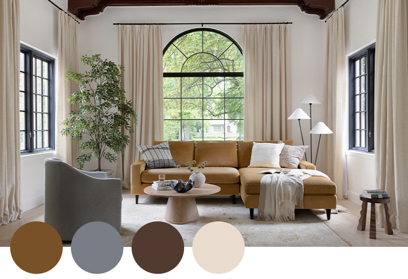
Neutral Colors: Stability and Versatility
Neutrals form the foundation of most interiors. They allow other colors to shine while providing visual rest.
Popular neutral tones include:
-
White and off-white for freshness
-
Beige and taupe for warmth
-
Gray for modern balance
Neutrals are ideal for large surfaces like walls and floors, especially in open-plan homes.
How Light Changes the Way Color Feels
Lighting dramatically alters how color is perceived. The same shade can feel warm or cold depending on light source and direction.
Consider these factors:
-
Natural light: North-facing rooms feel cooler, south-facing rooms feel warmer
-
Artificial light: Warm bulbs soften colors, cool bulbs sharpen them
-
Finish: Matte absorbs light, gloss reflects it
Always test paint samples on walls and observe them at different times of day.
Choosing the Right Colors Room by Room
Living Room
Aim for balance. Soft neutrals paired with warm accents create a welcoming atmosphere.
Bedroom
Choose calming shades like blue, green, or muted lavender to promote rest and better sleep.
Kitchen
Warm colors encourage appetite and conversation, while white and light gray keep things fresh and clean.
Bathroom
Cool tones like aqua, soft blue, and gray evoke cleanliness and relaxation.
Home Office
Blues and greens enhance focus, while small doses of yellow can boost creativity.
Common Color Mistakes to Avoid
-
Using overly bright colors on all four walls
-
Ignoring undertones in neutrals
-
Forgetting how colors flow between adjacent rooms
-
Choosing trends over personal comfort
A home should reflect how you want to feel, not just what’s fashionable.
FAQ: Psychology of Color in Home Decor
1. Can color really affect mood in a noticeable way?
Yes. Studies show color influences emotions, stress levels, and even physical responses like heart rate and appetite.
2. Is it better to use bold colors or neutrals for walls?
Neutrals are safer for large surfaces, while bold colors work best as accents unless carefully balanced.
3. How many colors should I use in one room?
A good rule is three: a dominant color, a secondary color, and an accent shade.
4. Do dark colors make rooms feel smaller?
Dark colors can make a space feel cozier, but when used well, they can also add depth rather than shrink a room.
5. Should every room have a different color palette?
Not necessarily. Repeating tones throughout the home creates harmony and visual flow.
6. How do I choose colors if I’m sensitive to overstimulation?
Stick to muted, cool, or neutral shades and avoid high-contrast combinations.
7. Are color trends important in home decor?
Trends can inspire ideas, but long-term comfort and personal preference matter far more.